Introduction: The Subconscious Language of Color
Color is rarely merely seen; it is felt, remembered, and profoundly influences our subconscious perceptions. Within the realm of interior design, this influence transcends aesthetic preference, becoming a powerful tool for shaping mood, evoking emotion, and ultimately defining the very essence of a space. For centuries, artists and designers have intuitively understood this connection, employing color not simply as decoration but as a fundamental element of communication – a silent language that speaks directly to our senses and deeply impacts our wellbeing. This exploration delves into the fascinating world of abstract color palettes, tracing their historical roots, decoding their emotional resonance, and revealing how they can be masterfully applied to create interiors that are both visually stunning and profoundly harmonious.
The Historical Roots of Abstract Color Theory
Abstract expressionism in the United States emerged as a distinct art movement in the aftermath of World War II and gained mainstream acceptance in the 1950s, a shift from the American social realism of the 1930s influenced by the Great Depression an...
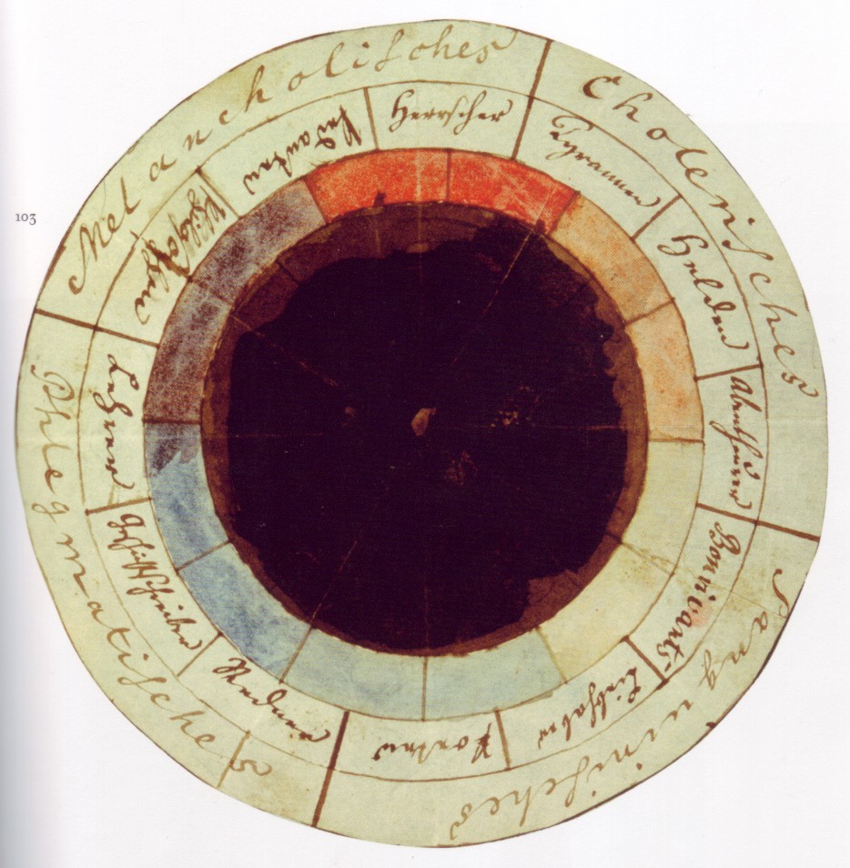
While the deliberate manipulation of color for psychological effect may seem a modern pursuit, its origins lie deep within art history. Consider the symbolic weight assigned to colors in Renaissance painting – the rich blues representing divinity, the fiery reds signifying passion and sacrifice. These weren’t arbitrary choices; they were deeply embedded within cultural and religious frameworks. However, it was the 19th and 20th centuries that witnessed a radical shift towards understanding color as an independent force. Goethe's Theory of Colours (1810) laid foundational groundwork, exploring the subjective experience of color and its physiological effects. But it was the advent of Abstract Expressionism in post-World War II America that truly liberated color from representational constraints. Artists like Mark Rothko, Wassily Kandinsky, and Jackson Pollock eschewed traditional forms, focusing instead on the raw emotional power of hue, shape, and texture. Rothko’s monumental canvases, for example – such as “Violet, Black, Orange, Yellow on White and Red” – weren't depictions *of* anything; they *were* emotions themselves, rendered in layers of luminous color designed to elicit a visceral response from the viewer. Kandinsky, similarly, believed that color possessed spiritual qualities, capable of directly influencing the soul. His “Improvisation 5” exemplifies this belief, a dynamic interplay of forms and colors intended to evoke synesthetic experiences.
Decoding Emotional Responses to Key Color Palettes
 Wikipedia: Color psychology
Color psychology is the study of colors and hues as a determinant of human behavior. Color influences perceptions that are not obvious, such as the taste of food. Colors have qualities that may cause certain emotions in people. How color influences i...
The study of color psychology reveals consistent, though nuanced, emotional associations. Warm tones – reds, oranges, and yellows – are inherently stimulating, evoking feelings of energy, passion, excitement, and even aggression. These colors can be incredibly effective in social spaces like living rooms or dining areas, fostering conversation and creating a vibrant atmosphere. However, overuse can lead to restlessness or anxiety; balance is crucial. Cool tones – blues, greens, and purples – conversely promote tranquility, relaxation, and introspection. Blues are often associated with serenity and stability, making them ideal for bedrooms or studies. Greens evoke nature and renewal, fostering a sense of calm and wellbeing. The power lies not just in the color itself but also in its saturation and value. Light pastels create a serene environment, while deep, saturated hues convey sophistication and depth. Black, often perceived as somber, can also represent order, elegance, and strength when used strategically. White, conversely, embodies purity, simplicity, and spaciousness. It’s important to remember that cultural context plays a significant role; red, for instance, symbolizes good fortune in many Eastern cultures, while it represents danger or warning in the West.
Applying Color Psychology in Interior Space Planning
Translating these psychological principles into practical interior design requires careful consideration of both function and personal preference. Begin by defining the desired atmosphere for each space. A home office, for example, might benefit from a calming palette of blues and greens to promote focus and productivity, punctuated with touches of yellow or orange to stimulate creativity. A living room, intended for social interaction, could embrace warmer tones balanced with neutral shades to create a welcoming and inviting environment. Bedrooms should prioritize tranquility; soft blues, lavenders, and muted greens are excellent choices. Consider the interplay of light and shadow – lighter colors reflect more light, making spaces feel larger and airier, while darker colors absorb light, creating intimacy and coziness. Texture also plays a vital role; incorporating natural materials like wood or stone can add depth and warmth to any palette. Don’t be afraid to experiment with layering different shades and tones within the same color family to create visual interest and complexity.
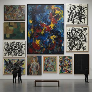
Case Studies: Harmonizing Abstract Art with Architectural Design
The integration of abstract art into interior spaces offers a unique opportunity to amplify the emotional impact of color. A minimalist living room, for example, might be dramatically enhanced by a large-scale Rothko reproduction – “White on Red” could serve as a focal point, injecting a powerful dose of energy and sophistication. Conversely, a more traditional dining room could benefit from a Kandinsky print, adding a touch of vibrancy and intellectual stimulation. The key is to select artwork that complements the existing architectural design and reinforces the desired atmosphere. Consider the scale of the artwork in relation to the space; a small painting might be lost on a large wall, while an oversized piece can overwhelm a smaller room. Framing also plays a crucial role; a simple frame allows the artwork to take center stage, while a more ornate frame can add a touch of formality or elegance. BuyPopArt.com offers bespoke reproduction services allowing for precise customization of size and framing, ensuring that each piece is perfectly tailored to your specific needs.
Beyond Aesthetics: Creating Atmospheres for Wellbeing
Ultimately, the most successful interior design transcends mere aesthetics; it creates an atmosphere that nurtures wellbeing and enhances quality of life. By understanding the subconscious language of color and applying its principles thoughtfully, we can transform our homes into sanctuaries – spaces that reflect our personalities, evoke positive emotions, and support our physical and mental health. The power of abstract art lies in its ability to bypass conscious thought, speaking directly to our senses and creating a visceral connection with the viewer. Whether it’s the luminous depths of a Rothko canvas or the dynamic energy of a Kandinsky composition, these artworks have the capacity to uplift, inspire, and transform the very essence of a space. At BuyPopArt.com, we believe that art should be accessible to everyone, offering museum-quality reproductions and personalized consultations to help you curate a collection that reflects your unique vision and enhances your everyday life. Explore our extensive library of artworks – from Impressionism to Modernism – and discover the transformative power of color today.