The Historical Roots of Color Symbolism: From Antiquity to the Renaissance
 Wikipedia: Color theory
Color theory, or more specifically traditional color theory, is a historical body of knowledge describing the behavior of colors, namely in color mixing, color contrast effects, color harmony, color schemes and color symbolism. Modern color theory is...
Long before formal color theory emerged, civilizations across the globe imbued colors with profound meaning. In ancient Egypt, pigments weren’t merely aesthetic choices; they were potent symbols woven into the fabric of religious belief and social hierarchy. Red, representing life and vitality, adorned royal garments and sacred spaces, while lapis lazuli blue—imported at great cost—signified divinity and the heavens. These early associations weren't arbitrary; they stemmed from observations of nature – the blood’s crimson hue, the sky’s vast expanse – and a deep-seated desire to connect with the cosmos. The Greeks, too, linked colors to specific deities and emotional states, though their approach was more philosophical, exploring color as an element within a broader system of natural order. Aristotle's writings on color laid some of the earliest foundations for understanding its perceived qualities, even if his theories differed significantly from modern scientific perspectives.
The Roman Empire continued many Egyptian and Greek traditions, but also introduced practical applications of color in architecture and decoration. However, it was during the Medieval period that color symbolism reached a particularly complex level within Western art. Dominated by religious iconography, colors became codified representations of spiritual concepts. Gold, naturally, signified divine light and power, while blue—painstakingly derived from ultramarine pigment made from lapis lazuli—was reserved for depictions of the Virgin Mary, reflecting its preciousness and association with heaven. The Renaissance witnessed a shift in perspective, fueled by renewed interest in classical learning and scientific observation. Artists like Leonardo da Vinci meticulously studied light and shadow, recognizing color’s role in creating depth and realism. While still retaining symbolic weight, color began to be understood as a tool for representing the physical world with greater accuracy.
Color Theory & Perception: A Scientific Foundation for Artistic Expression
 The Chromatic Spectrum of Feeling: Exploring Color & Emotion in Art History
Explore the fascinating relationship between color and emotion in art history. Discover how master artists used color to evoke feelings & cultural meanings, plus the psychology behind it all.
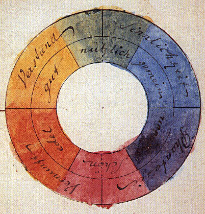
The 17th century marked a turning point with Isaac Newton’s groundbreaking experiments on light and optics. His demonstration that white light comprised a spectrum of colors revolutionized understanding, moving away from the idea of color as an inherent property of objects towards recognizing it as a product of perception. This discovery laid the groundwork for formal color theory, though interpretations varied widely. Johann Wolfgang von Goethe's Theory of Colours (1810), while not scientifically rigorous by modern standards, offered a deeply insightful exploration of subjective visual experience and the psychological effects of color. He focused on how colors *felt* rather than their precise wavelengths.
The 19th century saw further advancements with Michel Eugène Chevreul’s work on simultaneous contrast – the phenomenon where colors appear different depending on their surrounding hues. This principle, born from his research in textile manufacturing, profoundly influenced Impressionist painters like Monet and Renoir, who exploited color interactions to create vibrant, dynamic compositions. Later, artists and theorists developed systematic approaches to color organization, such as the Munsell Color System, which provided a standardized way of representing and classifying colors. Understanding these scientific principles—the additive and subtractive mixing of colors, complementary relationships, and the impact of light on perception—became essential for artists seeking to control the emotional impact of their work.
Emotional Resonance: How Master Artists Evoked Feelings Through Hue and Tone
 The Emotional Palette: How Color Influences Mood & Meaning in Art
Explore the powerful connection between color & emotion in art history. Discover how master artists used color to evoke feelings and learn to select artwork that enhances your space.
Beyond technical mastery, great artists intuitively understood color’s power to evoke specific emotions. Consider the warm, inviting palette of Rembrandt's portraits, utilizing rich browns, golds, and ochres to convey intimacy and psychological depth. Conversely, the cool blues and grays in Edvard Munch’s The Scream amplify a sense of isolation and existential angst. These choices weren’t accidental; they were deliberate attempts to tap into the subconscious associations we have with certain colors.
Red, often linked to passion, energy, and danger, has been used throughout history to command attention – from the dramatic reds in Caravaggio's religious scenes to the bold strokes of Mark Rothko’s abstract expressionist canvases. Blue, conversely, frequently evokes feelings of tranquility, melancholy, or spirituality, as seen in Van Gogh’s turbulent night skies and Yves Klein’s immersive ultramarine monochromes. The use of color also extends beyond individual hues; tonal variations—the subtle shifts in lightness and darkness—play a crucial role in creating mood and atmosphere. A muted palette can convey a sense of nostalgia or restraint, while high-contrast colors often signal excitement or conflict.
Cultural Chromatics: Variations in Color Meaning Across Global Traditions
While certain emotional associations with color may be universal to some extent, cultural contexts profoundly shape their interpretation. In Western cultures, white is traditionally associated with purity and innocence, but in many Eastern traditions—particularly China and Japan—it symbolizes mourning and death. Similarly, green, often linked to nature and growth in the West, can represent prosperity or illness in other parts of the world.
- China: Red is considered a lucky color symbolizing happiness, prosperity, and good fortune, frequently used in celebrations and ceremonies.
- India: Colors are deeply intertwined with religious beliefs and social status. Saffron represents sacrifice and renunciation, while red signifies auspiciousness and fertility.
- Japan: Subtle color combinations and seasonal palettes reflect a reverence for nature and harmony. White often symbolizes purity and mourning, while black can represent strength and dignity.
Understanding these cultural nuances is crucial for art collectors seeking to appreciate the full depth of an artwork’s meaning. A piece that resonates powerfully within one culture may evoke entirely different emotions in another. Recognizing these variations demonstrates a sophisticated understanding of both artistic technique and global perspectives.
The Psychology of Color in Collecting: Selecting Art That Enhances Your Space
 Harmonizing Spaces: A Guide to Utilizing Color Palettes in Interior Design
Elevate your interior design projects with our expert guide to color palettes! Learn the psychology of color & create harmonious spaces that impress clients. Essential tips for freelance decorators.
Beyond aesthetic preference, the colors present in artwork can significantly impact the mood and atmosphere of your home or office. Consider the psychological effects when selecting pieces for specific spaces. Warm-toned paintings—featuring reds, oranges, and yellows—can create a welcoming and energizing environment, ideal for living rooms or dining areas. Cool-toned works—with blues, greens, and violets—promote relaxation and contemplation, making them suitable for bedrooms or studies.
The size and scale of the artwork also play a role. A large, vibrant canvas can dominate a room, creating a focal point and stimulating conversation. Smaller pieces, on the other hand, may offer subtle accents that complement existing décor. Ultimately, the goal is to create a harmonious balance—selecting artworks that not only appeal to your personal taste but also enhance the overall emotional experience of the space. At BuyPopArt.com, we offer personalized art consultations to help you navigate these considerations and find pieces that perfectly suit your aesthetic vision.
Color as Investment: Trends, Rarity & the Value of Palettes in Art History
While artistic merit remains paramount, color palettes can also influence an artwork’s value. Certain pigments—such as ultramarine blue derived from lapis lazuli—were historically rare and expensive, making paintings featuring them particularly prized. The condition of these colors is also crucial; vibrant, well-preserved hues contribute significantly to a piece’s overall appeal.
Trends in color preferences can also impact market demand. For example, the Impressionists' innovative use of color revolutionized painting and continues to influence contemporary artists. Works featuring bold, unconventional palettes often command higher prices due to their historical significance and aesthetic impact. Collectors should consider not only the artist’s reputation but also the unique qualities of the artwork itself—the interplay of colors, the technique employed, and the overall emotional resonance it evokes. BuyPopArt.com provides expert art appraisal services to help you understand the value of your collection and make informed investment decisions.