
Óleo sobre lienzo pintado a mano en el tamaño y marco de su elección, realizado por encargo por nuestros artistas. (![]() Pedir impresión
Pedir impresión![]() Comprar descarga)
Comprar descarga)


Elija entre nuestros tamaños predefinidos que respetan las proporciones originales de la obra.
Puede ingresar sus propias dimensiones para adaptarse a un marco o espacio específico. Si el tamaño seleccionado no coincide con las proporciones de la imagen original, recortaremos la obra o extenderemos la pintura con elementos adicionales pintados a mano. Se le enviará una maqueta digital para su aprobación antes de comenzar la producción.
Tenga en cuenta que la vista previa en pantalla no refleja el recorte o la extensión reales. Solo la maqueta mostrará con precisión la composición final.
Si bien existen tamaños personalizados, recomendamos seleccionar una dimensión de la lista predefinida para preservar las proporciones originales.
Envío a todo el mundo () en 3-4 semanas en lugar de las 5 semanas estándar. (16 agosto). Sin comprometer la calidad.


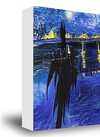
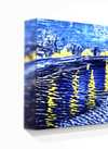
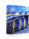
Counter composition X
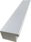
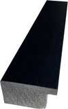
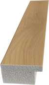
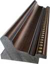
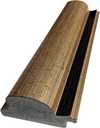
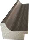
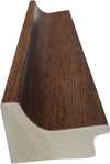
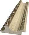
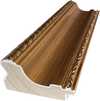
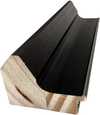
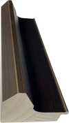
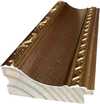
Tamaño de la reproducción
To stand before Theo van Doesburg's Counter composition X is not merely to observe paint on canvas; it is to encounter a moment of profound intellectual clarity, a visual manifesto rendered in primary colors and absolute structure. This piece, dating from 1924, pulses with the revolutionary spirit of early modernism. It presents itself as a seemingly simple square, yet within its rigid confines—the bold placement of red in the upper left, yellow centrally positioned, blue anchoring the lower left, and black completing the composition in the lower right—lies an entire philosophy. Van Doesburg strips away the illusion of depth and narrative chaos, leaving behind only the essential dialogue between form and color.
This work is deeply embedded within the ethos of Neoplasticism, the movement that gave rise to De Stijl. For Van Doesburg, art could no longer afford the sentimental trappings of representation. The world, he argued, was best understood not through mimicry, but through its underlying structural harmonies. Counter composition X embodies this quest for universal order. The technique is characterized by an almost ascetic purity; clean lines meet flat planes of saturated color. It speaks to a desire to distill existence down to its most fundamental components—the vertical and the horizontal, the primary hues. Owning a reproduction of this piece allows one to bring that same sense of disciplined harmony into a contemporary living space.
The selection of colors is never arbitrary; it is a carefully orchestrated symbolic language. The primaries—red, yellow, and blue—are the foundational notes of visual experience, while black provides the necessary grounding counterpoint. These elements interact not as separate entities, but as interdependent forces balancing within the square matrix. Consider the tension between the vibrant red corner and the deep, stabilizing black quadrant. This interplay suggests a dynamic equilibrium—a perfect balance achieved through opposing yet complementary forces. It is an abstract meditation on structure itself, suggesting that true beauty resides in the relationship between parts.
For the collector or designer, Counter composition X offers more than mere decoration; it offers a focal point of contemplation. Its bold graphic nature acts as an immediate visual anchor, capable of elevating any room from mundane to monumental. The emotional impact is one of invigorating calm—the kind that comes from understanding underlying principles. It demands that the viewer slow down, look closer, and engage their intellect alongside their eye. Whether displayed in a minimalist gallery setting or integrated into a richly decorated interior, this painting asserts an undeniable modern sophistication, celebrating geometry as the ultimate form of expressive power.

1883 - 1931 , Países Bajos

Discover the power of Neo-Abstract art. Explore how bold geometric forms and high-impact visual energy are redefining modern design. Learn to curate sophisticated, high-energy spaces with the latest trends in contemporary abstraction and structural color.

Discover the high-impact world of Geometric Abstraction. From Cubist roots to modern urban trends, explore how bold shapes and colors redefine contemporary design. Elevate your space with expert art insights and custom-made abstract masterpieces.

Master the high-impact world of contemporary abstraction. Discover how bold colors, textures, and modern movements like Abstract Expressionism can transform your space with premium, high-energy art curated for the design-conscious professional.


Manténgase al día con las últimas noticias de arte, ofertas exclusivas e ideas de decoración.
Cuéntanos sobre tu proyecto y nuestros expertos en arte te ofrecerán 3 sugerencias de obras personalizadas.
Dejamos que nosotros seleccionemos 3 opciones exclusivas para ti – ¡Gratis!
 Compartir


 La opción de vidrio solo está disponible en tamaños inferiores a 110 cm.


