
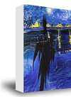
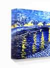
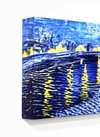
빠른 제작과 다양한 마감 옵션을 제공하는 박물관 품질의 지클레이 또는 캔버스 프린트. ( 손으로 그린 그림 구매 이미지 구매)
작품의 원본 비율을 유지하는 미리 설정된 크기 중에서 선택하세요.

특정 프레임이나 공간에 맞춰 직접 치수를 입력하실 수 있습니다. 선택하신 사이즈가 원본 이미지의 비율과 일치하지 않을 경우, 작품을 크롭(자르기)하거나 이미지를 대칭 또는 단색 채우기로 확장하여 제작합니다. 제작 시작 전, 최종 확인을 위해 디지털 목업이 전송됩니다.
화면상의 미리보기는 실제 크롭이나 확장 상태를 반영하지 않으므로, 최종 구도는 오직 목업을 통해서만 정확하게 확인하실 수 있습니다.
맞춤 사이즈 제작도 가능하지만, 원본 비율을 유지하기 위해서는 사전 정의된 목록에서 치수를 선택하시는 것을 권장합니다.

Honor badge
복제본 크기
In the vibrant, often overlooked landscape of East German visual culture, few figures wielded as much quiet authority over the written word as Axel Bertram. Born in Dresden in 1936, a city that would become a crucible for his artistic identity, Bertram emerged from the shadows of a transformative era to become a master of what might be called "socialist typography." His journey was not merely one of aesthetic pursuit but a disciplined navigation through the complexities of mid-century Germany. Influenced deeply by his father, a graphic artist who instilled in him the fundamental principles of visual communication, Bertram’s early years were marked by a burgeoning understanding of how form and function intersect to create meaning.
His formal education at the Academy for Fine Arts Berlin-Weißensee provided the rigorous academic foundation necessary to transform raw talent into professional mastery. Under the mentorship of legendary figures such as Klaus Wittkugel, Werner Klemke, Arno Mohr, and Ernst Vogenauer, Bertram absorbed a unique blend of modernist experimentation and humanist ideals. This period was crucial; it allowed him to develop a style that balanced the stark, functional requirements of graphic design with a lyrical, almost poetic sensibility. By 1960, alongside his fellow students, he co-founded the studio collective "Gruppe 4," signaling his arrival as a significant force in the independent graphic scene of Berlin.
Bertram’s career was defined by an extraordinary versatility that saw him moving seamlessly between the monumental and the minute. He did not merely design letters; he breathed life into them, treating typography as a living, breathing component of visual storytelling. His work for iconic East German publications like Sibylle and the NBI (Neue Berliner Illustrierte) showcased his ability to capture the zeitgeist—a delicate equilibrium of optimism and restraint. Whether he was redesigning the logo for Berlin’s Metropol Theatre or crafting the visual identity for the Wochenpost, his hand was unmistakable: clean, authoritative, yet deeply expressive.
His contributions extended far beyond the printed page into the very fabric of daily life in the GDR. His portfolio included:
Beyond his individual output, Bertram was a pillar of the artistic community. His tenure as a professor at the Berlin-Weißensee Academy allowed him to shape the next generation of designers, passing on the rigorous standards of Gebrauchsgrafik (applied graphics) that he had mastered. As the vice-president of the East German Visual Artists’ Century (VBK), he occupied a position of significant influence, advocating for the importance of design as a tool for social and cultural discourse. His receipt of the Art Prize of the GDR in 1977 served as a formal recognition of his role in defining the visual language of his era.
Even as the political landscape shifted with the reunification of Germany, Bertram’s commitment to the craft remained unshakable. His legacy is preserved not just in the archives of the German Book and Letter Museum in Leipzig, but in the very way we perceive the elegance of the German alphabet. He remains a "quiet maestro," an artist who understood that true impact often lies in the subtle, perfectly placed curve of a letter or the balanced weight of a typeface, leaving an indelible mark on the history of European graphic design.

1936 - 2019 , Germany


최신 미술 뉴스, 특별 혜택 및 인테리어 아이디어를 가장 먼저 만나보세요.
프로젝트에 대해 알려주시면 저희 미술 전문가들이 맞춤형 아트 제안 3가지를 전달해 드립니다.
당신만을 위한 맞춤형 옵션 3가지를 무료로 추천해 드립니다!


 미리보기
미리보기
 공유하기
공유하기 공유하기
공유하기
 상세 정보
상세 정보

 다운로드
다운로드
 유사 작품
유사 작품 X-레이
X-레이 슬라이드 쇼

 더 보기
더 보기
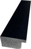
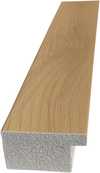
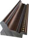
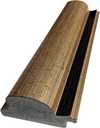
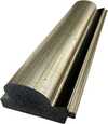
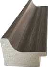
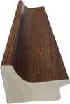
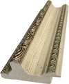
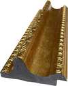
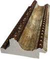
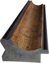
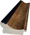
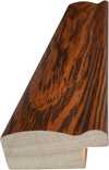
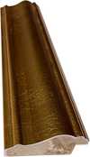
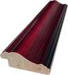
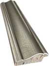
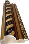
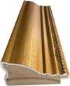
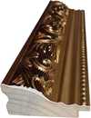
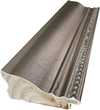
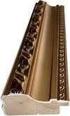
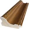
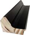
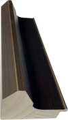
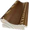
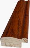
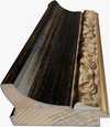
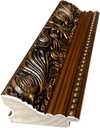
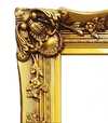
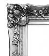
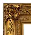
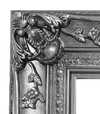


 유리 옵션은 110cm 미만 크기에서만 선택 가능합니다.


