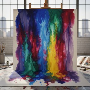
Printuri giclée sau pe canvas de calitate muzeală, cu proces de producție rapid și opțiuni flexibile de finisare. (![]() Cumpără pictură lucrată manual
Cumpără pictură lucrată manual![]() Cumpără imagine)
Cumpără imagine)

Alegeți dintre dimensiunile noastre prestabilite, care respectă proporțiile originale ale operei de artă.
Puteți introduce propriile dimensiuni pentru a se potrivi unui anumit cadru sau spațiu. Dacă dimensiunea selectată nu corespunde proporțiilor imaginii originale, vom decupa lucrarea de artă sau vom extinde imaginea cu margini oglindite sau cu o culoare uniformă. Un mockup digital va fi trimis pentru aprobarea dumneavoastră înainte de începerea producției.
Vă rugăm să rețineți că previzualizarea de pe ecran nu reflectă decuparea sau extinderea reală. Doar mockup-ul va arăta cu exactitate compoziția finală.
Deși dimensiunile personalizate sunt disponibile, vă recomandăm să selectați o dimensiune din lista predefinită pentru a păstra proporțiile originale.
Livrare în întreaga lume () în 2 săptămâni, în loc de cele 4/5 săptămâni standard. (12 August)


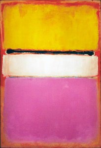
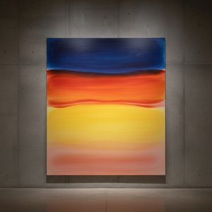
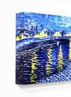
No. 3
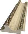
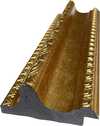
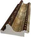
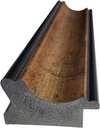
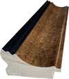
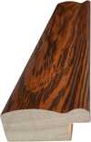
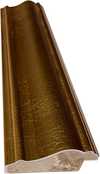
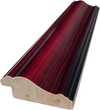
Dimensiune reproducere
Mark Rothko’s “No. 3” isn’t a painting that shouts; it whispers. It’s an invitation to quiet contemplation, a deliberate rejection of representational art in favor of pure emotional expression. Created during the heart of his mature style – roughly between 1949 and 1970 – this work embodies the core tenets of Abstract Expressionism while simultaneously forging its own unique path. The piece immediately draws the viewer into a space of profound introspection, utilizing a muted color palette dominated by deep blues, blacks, and greens layered over an orange foundation. It’s not simply a collection of colors; it's a carefully orchestrated symphony of tones designed to evoke a specific mood – one of melancholy, solitude, and perhaps even a touch of existential longing.
The power of “No. 3” lies not in its subject matter – which is deliberately ambiguous, hinting at figures or forms rather than explicitly depicting them – but in the meticulous execution of Rothko’s technique. Thick, layered brushstrokes are visible throughout the canvas, creating a tactile surface that invites close examination. These aren't sharp lines or defined edges; instead, they bleed into one another, blurring the boundaries between shapes and colors. This layering is crucial to the painting’s depth – it creates an illusion of space, drawing the eye inward and encouraging the viewer to lose themselves within the composition. Rothko famously described his paintings as “doors” or “windows,” suggesting a portal into another realm. Here, those doors are open, offering glimpses of something beyond the purely visual.
The deliberate lack of perspective is equally significant. Rothko abandoned traditional notions of linear space, opting instead for an implied sense of depth through color and layering. The overlapping forms create a dynamic interplay of positive and negative space, guiding the viewer’s eye across the canvas in a continuous, almost meditative, flow. It's a technique that mirrors the artist’s own exploration of spirituality and the search for meaning beyond the material world.
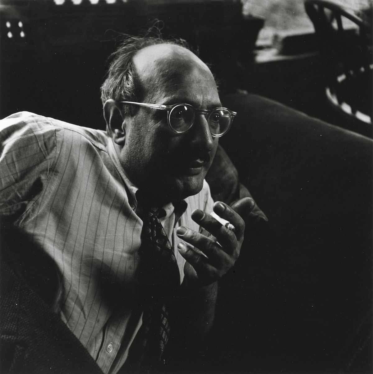
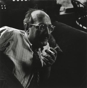
Understanding Mark Rothko requires acknowledging his deeply personal journey. Born in 1903 in Daugavpils, Latvia (then part of the Russian Empire), he experienced a childhood marked by displacement and uncertainty – a legacy of shifting borders, pogroms, and the trauma of immigration to Portland, Oregon, where his father, a pharmacist and intellectual, tragically died shortly after their arrival. This early exposure to loss and instability profoundly shaped Rothko’s artistic vision. He grappled with themes of mortality, faith, and the human condition throughout his career, seeking to express universal emotions through abstract forms. His work during this period reflects a deep engagement with existential questions – questions about life, death, and the search for meaning in an often-chaotic world.
The Rothko Chapel in Houston, Texas, serves as a poignant example of how the artist envisioned his paintings interacting with space. The fourteen Rothko panels within the chapel’s walls are designed to create a contemplative atmosphere, inviting viewers to engage in silent reflection. “No. 3” shares this spirit of quiet intensity, offering a visual meditation on the complexities of human experience.
While Rothko resisted definitive interpretations of his work, certain symbolic readings have emerged over time. The dominant blues and blacks are often associated with sadness, mourning, or introspection – reflecting the artist’s own personal struggles. The orange hue, appearing as a subtle undercurrent, can be seen as representing hope, warmth, or even spiritual illumination. The ambiguity of the forms themselves allows for individual interpretation, inviting each viewer to project their own emotions and experiences onto the canvas. “No. 3” is not simply a painting; it’s an emotional landscape – a space where the viewer becomes an active participant in the creation of meaning.
1903 - 1970 , Letonia

Explore the captivating world of Color Field painting! Discover its origins, key artists like Rothko & Newman, philosophical depth, and lasting influence on modern art. Expert insights for collectors.
Explore the profound emotional depth of Mark Rothko's abstract expressionism. Discover the history, techniques & lasting impact of this pivotal Color Field painter. Expert insights for collectors and art enthusiasts.
Explore the groundbreaking abstract expressionism of Morris Louis, a pioneer of Color Field painting. Discover his innovative techniques, influential series & lasting legacy in post-war American art. Learn more at BuyPopArt.
Explore the life & work of Jacob Kainen, a pivotal figure in American Abstract Expressionism and Color Field painting. Discover his journey from Social Realism to vibrant abstraction and lasting influence on 20th-century art.

Explore the profound world of Color Field painting with BuyPopArt. Discover key artists like Rothko & Newman, its philosophical roots, and lasting impact on modern art. Expert insights for collectors.


Rămâneți la curent cu cele mai recente știri din lumea artei, ofertele noastre exclusive și ideile de decor.
Spuneți-ne despre proiectul dumneavoastră, iar experții noștri în artă vă vor oferi 3 sugestii personalizate.
Vom selecta 3 opțiuni special pentru tine – Gratuit!
 Trimite

 Opțiunea cu sticlă este disponibilă doar pentru dimensiuni de sub 110 cm