
Printuri giclée sau pe canvas de calitate muzeală, cu proces de producție rapid și opțiuni flexibile de finisare. (![]() Comandă pictură lucrată manual
Comandă pictură lucrată manual![]() Cumpără imaginea)
Cumpără imaginea)
Alegeți dintre dimensiunile noastre prestabilite, care respectă proporțiile originale ale operei de artă.
Puteți introduce propriile dimensiuni pentru a se potrivi unui anumit cadru sau spațiu. Dacă dimensiunea selectată nu corespunde proporțiilor imaginii originale, vom decupa lucrarea de artă sau vom extinde imaginea cu margini oglindite sau cu o culoare uniformă. Un mockup digital va fi trimis pentru aprobarea dumneavoastră înainte de începerea producției.
Vă rugăm să rețineți că previzualizarea de pe ecran nu reflectă decuparea sau extinderea reală. Doar mockup-ul va arăta cu exactitate compoziția finală.
Deși dimensiunile personalizate sunt disponibile, vă recomandăm să selectați o dimensiune din lista predefinită pentru a păstra proporțiile originale.
Livrare în întreaga lume () în 2 săptămâni, în loc de cele 4/5 săptămâni standard. (18 August)


Counter composition XV
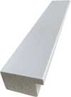
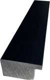
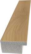
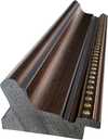
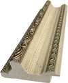
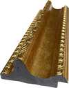
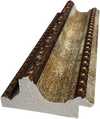
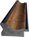
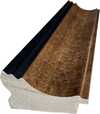
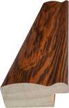
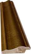
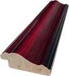
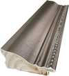
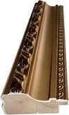
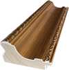
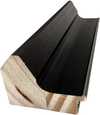
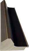
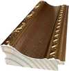
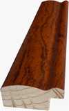
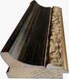
Dimensiune reproducere
Theo van Doesburg's "Counter Composition XV," painted in 1925, isn’t merely a painting; it’s a distilled essence of the De Stijl movement – a radical declaration of order and universal harmony. This deceptively simple work, executed against a stark white canvas, pulsates with an underlying tension born from the careful orchestration of geometric forms and primary colors. It represents a pivotal moment in 20th-century art, moving beyond representational imagery to explore the very foundations of visual language itself. The piece immediately commands attention not through elaborate detail or narrative, but through its profound sense of balance and its unwavering commitment to abstraction.
At first glance, the composition appears austere – a red rectangle dominating the upper left quadrant, juxtaposed with a blue counterpart in the lower right. However, this initial impression quickly gives way to an appreciation for the intricate grid that underpins the entire work. A network of black and white squares, meticulously arranged, creates a dynamic interplay of movement and stillness, suggesting both order and potential disruption. This isn’t haphazard placement; it's a deliberate choreography designed to evoke a feeling of controlled dynamism – a visual embodiment of De Stijl’s core philosophy.
The brilliance of "Counter Composition XV" lies in its reduction. Van Doesburg stripped away all extraneous elements, leaving only the fundamental building blocks of form and color: red, yellow, blue, black, and white. This limited palette wasn’t chosen arbitrarily; each hue was selected for its inherent purity and intensity, intended to be experienced without distraction. The application is equally crucial – flat, unmodulated areas devoid of shading or blending. This technique emphasizes the geometric shapes themselves, highlighting their sharp edges and creating a sense of crystalline clarity. It's a testament to the artist’s belief that beauty could be found in simplicity and precision.
The absence of perspective is equally significant. Van Doesburg deliberately rejects traditional spatial representation, opting instead for a two-dimensional plane where shapes are presented as independent entities. Overlapping elements and variations in size subtly suggest depth, but the overall effect is one of flattened planes interacting within a carefully constructed framework. This approach reflects De Stijl’s rejection of illusionism and its embrace of a purely conceptual understanding of space.
Beyond its formal qualities, "Counter Composition XV" carries profound symbolic weight. The geometric forms – rectangles, squares, lines – are not merely decorative; they represent fundamental principles of order, balance, and harmony. The primary colors, stripped of their associations with natural phenomena, become pure expressions of energy and vibration. Van Doesburg believed that through the rigorous application of these abstract elements, artists could create a visual language capable of transcending individual expression and communicating universal truths. The piece is an attempt to build a new aesthetic based on mathematical ratios and geometric relationships – a blueprint for a harmonious world reflected in art.
Theo van Doesburg’s “Counter Composition XV” stands as a powerful testament to the transformative potential of abstraction. It's more than just a painting; it’s an invitation to contemplate the underlying order of the universe and the possibility of creating beauty through pure geometric form. Its stark simplicity, combined with its profound symbolic depth, continues to resonate with viewers today, cementing its place as a cornerstone of modern art.

1883 - 1931 , Olanda

Unlock the power of De Stijl. Explore how the bold geometry and primary colors of Mondrian and Van Doesburg revolutionized modern design, from fine art to pop culture impact. Discover how to bring this high-impact, minimalist aesthetic into your contemporary space.

Master the high-impact world of contemporary abstraction. Discover how bold colors, textures, and modern movements like Abstract Expressionism can transform your space with premium, high-energy art curated for the design-conscious professional.

Discover how Neoplasticism and De Stijl redefined modern design. Explore the high-impact world of Piet Mondrian’s geometric precision, bold primary colors, and their lasting influence on contemporary street culture and urban aesthetics.

Dive into the high-energy world of Lyrical Abstraction. Explore how bold colors, fluid motion, and emotional depth define this modern masterpiece movement. Discover iconic artists and learn to bring this vibrant, soulful energy into your contemporary space.

Discover the power of Neo-Abstract art. Explore how bold geometric forms and high-impact visual energy are redefining modern design. Learn to curate sophisticated, high-energy spaces with the latest trends in contemporary abstraction and structural color.


Rămâneți la curent cu cele mai recente știri din lumea artei, ofertele noastre exclusive și ideile de decor.
Spuneți-ne despre proiectul dumneavoastră, iar experții noștri în artă vă vor oferi 3 sugestii personalizate.
Vom selecta 3 opțiuni special pentru tine – Gratuit!
 Trimite

 Opțiunea cu sticlă este disponibilă doar pentru dimensiuni de sub 110 cm


