Giclée ali platnati odtis muzejske kakovosti z hitro proizvodnjo in prilagodljivimi možnostmi končne obdelave. (![]() Kupi ročno naslikano sliko
Kupi ročno naslikano sliko![]() Kupi digitalno sliko)
Kupi digitalno sliko)
Izberite eno od naših vnaprej določenih velikosti, ki ustrezajo prvotnim proporcijam umetničkega dela.
Svoje dimenzije lahko vnesete sami, da bodo ustrezne za določen okvir ali prostor. Če izbrana velikost ne bo skladna z razmerji izvirne slike, bomo umetniško delo orezali ali podaljšali s pomočjo ogledalnega odraza ali barvno polnega roba. Pred začetkom proizvodnje vam bomo poslali digitalni predogled za potrditev.
Upoštevajte, da predogled na zaslonu ne prikazuje dejanskega orezovanja ali podaljševanja. Le digitalni predogled bo natančno prikazal končno kompozicijo.
Čeprav so na voljo prilagojene velikosti, priporočamo izbiro dimenzije s predhodno določenega seznama, da ohranite prvotna razmerja.
Globalna dostava () v 2 tednih namesto standardnih 4/5 tednov. (18 avgust)


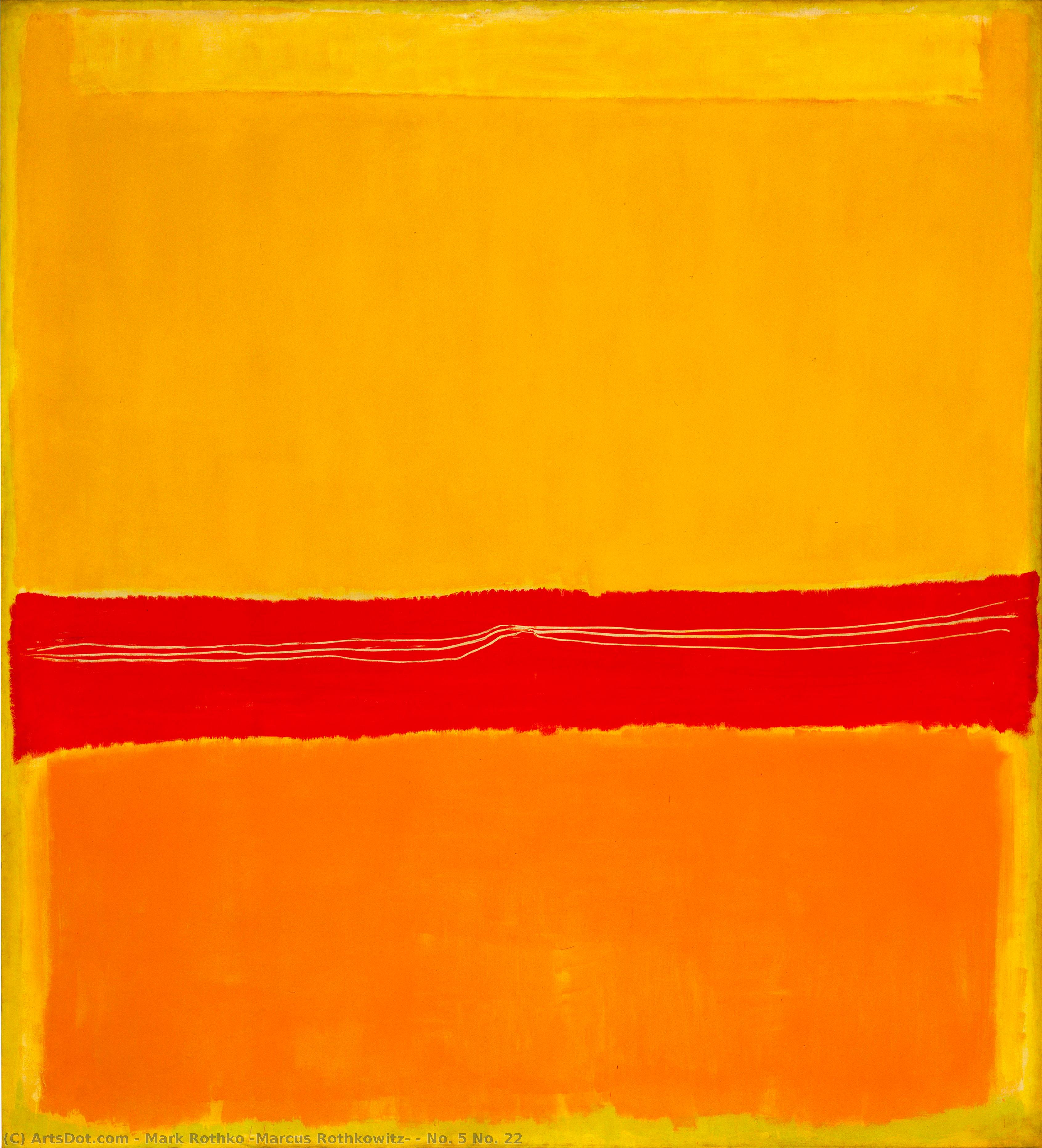
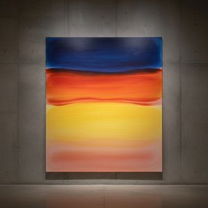
Št. 5 Št. 22
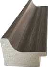
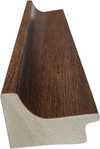
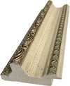
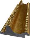
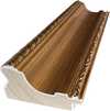
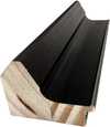
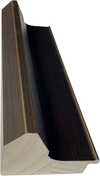
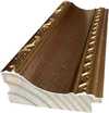
Velikost reprodukcije
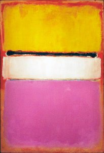
Mark Rothko’s *No. 5/No. 22* isn't merely a painting; it’s an encounter, a quiet confrontation with the depths of human emotion and experience. Created in 1949-1950 during his pivotal period within Abstract Expressionism, this work transcends simple color arrangement, offering a glimpse into Rothko’s profound exploration of spirituality, tragedy, and ecstasy – themes that continue to resonate powerfully today.
The genesis of *No. 5/No. 22* lies in Rothko's deliberate rejection of representational imagery. He sought to bypass the intellect entirely, aiming instead to tap directly into the viewer’s subconscious through pure color and form. This shift stemmed from a deep dissatisfaction with traditional art – a desire to move beyond depicting the external world and grapple with the internal landscape of human feeling. The rectangular blocks, seemingly simple in their construction, are the result of years of experimentation, meticulously layering luminous hues to achieve an effect that is both monumental and intensely personal.
What truly distinguishes *No. 5/No. 22* is Rothko’s revolutionary technique. He didn't employ smooth blending; instead, he employed a deliberate act of disruption – gouging into the layers of vibrant red pigment with a blunt instrument. This process created subtle white lines that fracture the flatness of the canvas, introducing an element of controlled spontaneity and visual tension. The effect is remarkably tactile; you can almost *feel* the artist’s hand moving across the surface. The luminous yellows and oranges, applied in thick layers, seem to vibrate with an inner light, intensifying the emotional impact.
It's crucial to understand that Rothko wasn't interested in creating a visually pleasing composition. He was pursuing something far more ambitious: an experience of color itself – its weight, its warmth, its ability to evoke profound psychological responses. The subtle shifts in hue and tone, the way the colors interact with each other, are all carefully orchestrated to create a dynamic visual field that draws the viewer into a meditative state.
*No. 5/No. 22* was born from a period of intense personal and historical upheaval. Rothko’s early life, marked by displacement and antisemitism, undoubtedly shaped his artistic vision. The painting can be interpreted as a reflection of this trauma – a confrontation with the darker aspects of human existence. However, it's equally important to recognize the work’s capacity for transcendence. The sheer scale of the rectangles, combined with their luminous colors, creates a sense of awe and wonder, suggesting a connection to something larger than ourselves.
The painting’s enduring appeal lies in its ambiguity. Rothko deliberately avoided offering definitive interpretations, allowing viewers to project their own emotions and experiences onto the canvas. It's a space for contemplation, a place where personal meaning can be forged through direct engagement with the artwork.
Whether you’re a discerning collector seeking a masterpiece of modern art or an interior designer searching for a statement piece to elevate your space, *No. 5/No. 22* offers unparalleled possibilities. Its bold color palette and contemplative mood make it ideal for creating serene and sophisticated environments – particularly in living rooms, bedrooms, or meditation areas.
Let *No. 5/No. 22* become a window into the soul – a constant reminder of the beauty, complexity, and enduring mystery of human experience.
1903 - 1970 , Latvija
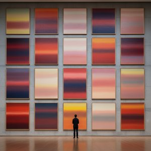
Odkrijte 25 mojstrovin Marka Rothka – ikonične slike ekspresionizma, polne barv in emocij. Preberite zgodbe za vsako umetnino in obogatite svoj dom z reprodukcijami vrhunske kakovosti na BuyPopArt.com.
Explore the profound emotional depth of Mark Rothko's abstract expressionism. Discover the history, techniques & lasting impact of this pivotal Color Field painter. Expert insights for collectors and art enthusiasts.
Odkrijte 10 mojstrin del abstraktnega ekspresionizma! Pollock, Rothko & De Kooning - zgodbe za kulise ikoničnih umetnin. Inspirirajte se in poiščite reprodukcije na BuyPopArt.com!

Explore the philosophical and aesthetic foundations of Color Field painting with BuyPopArt. Discover key artists like Rothko & Newman, its spiritual influences, and lasting impact on modern art. Expert insights for collectors.
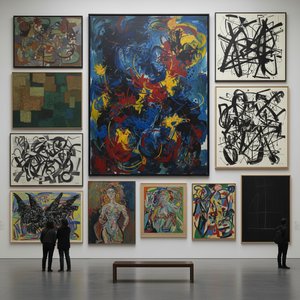
Explore the profound emotional world of Abstract Expressionism with BuyPopArt. Discover key artists like Pollock & Rothko, learn about collecting, and find museum-quality reproductions to inspire your space.


Bodite na sešte, s najnovejšimi novicami iz sveta umetnosti, ekskluzivnimi ponudbami in idejami za dekoracijo.
Povejte nam o svojem projektu in naši strokovnjaki za umetnost vam bodo pripravili 3 prilagojene predloge umetniških del.
Naj vam izberemo 3 možnosti – popolnoma brezplačno!
 Pošlji

 Možnost stekla je na voljo le za velikosti pod 110 cm