

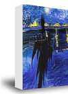
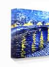
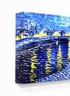
Håndmalet olie på lærred i din valgte størrelse og ramme, udført efter bestilling af vores kunstnere. ( Køb print Køb billede)
Vælg mellem vores forudindstillede størrelser, der matcher kunstværkets originale proportioner.

Du kan indtaste dine egne mål for at passe til en bestemt ramme eller plads. Hvis den valgte størrelse ikke stemmer overens med det originale billedes proportioner, vil vi enten beskære kunstværket eller udvide maleriet med yderligere håndmalede elementer. En digital skitse sendes til din godkendelse, før produktionen påbegyndes.
Bemærk venligst, at forhåndsvisningen på skærmen ikke afspejler den faktiske beskæring eller udvidelse. Kun skitsen vil nøjagtigt vise den endelige komposition.
Selvom specialmål er mulige, anbefaler vi at vælge en dimension fra den foruddefinerede liste for at bevare de originale proportioner.
Levering i hele verden () på 3/4 uger i stedet for de standard 5 uger. (14 august). Ingen kompromiser med kvaliteten.


Honor badge
Størrelse på reproduktion
In the vibrant, often overlooked landscape of East German visual culture, few figures wielded as much quiet authority over the written word as Axel Bertram. Born in Dresden in 1936, a city that would become a crucible for his artistic identity, Bertram emerged from the shadows of a transformative era to become a master of what might be called "socialist typography." His journey was not merely one of aesthetic pursuit but a disciplined navigation through the complexities of mid-century Germany. Influenced deeply by his father, a graphic artist who instilled in him the fundamental principles of visual communication, Bertram’s early years were marked by a burgeoning understanding of how form and function intersect to create meaning.
His formal education at the Academy for Fine Arts Berlin-Weißensee provided the rigorous academic foundation necessary to transform raw talent into professional mastery. Under the mentorship of legendary figures such as Klaus Wittkugel, Werner Klemke, Arno Mohr, and Ernst Vogenauer, Bertram absorbed a unique blend of modernist experimentation and humanist ideals. This period was crucial; it allowed him to develop a style that balanced the stark, functional requirements of graphic design with a lyrical, almost poetic sensibility. By 1960, alongside his fellow students, he co-founded the studio collective "Gruppe 4," signaling his arrival as a significant force in the independent graphic scene of Berlin.
Bertram’s career was defined by an extraordinary versatility that saw him moving seamlessly between the monumental and the minute. He did not merely design letters; he breathed life into them, treating typography as a living, breathing component of visual storytelling. His work for iconic East German publications like Sibylle and the NBI (Neue Berliner Illustrierte) showcased his ability to capture the zeitgeist—a delicate equilibrium of optimism and restraint. Whether he was redesigning the logo for Berlin’s Metropol Theatre or crafting the visual identity for the Wochenpost, his hand was unmistakable: clean, authoritative, yet deeply expressive.
His contributions extended far beyond the printed page into the very fabric of daily life in the GDR. His portfolio included:
Beyond his individual output, Bertram was a pillar of the artistic community. His tenure as a professor at the Berlin-Weißensee Academy allowed him to shape the next generation of designers, passing on the rigorous standards of Gebrauchsgrafik (applied graphics) that he had mastered. As the vice-president of the East German Visual Artists’ Century (VBK), he occupied a position of significant influence, advocating for the importance of design as a tool for social and cultural discourse. His receipt of the Art Prize of the GDR in 1977 served as a formal recognition of his role in defining the visual language of his era.
Even as the political landscape shifted with the reunification of Germany, Bertram’s commitment to the craft remained unshakable. His legacy is preserved not just in the archives of the German Book and Letter Museum in Leipzig, but in the very way we perceive the elegance of the German alphabet. He remains a "quiet maestro," an artist who understood that true impact often lies in the subtle, perfectly placed curve of a letter or the balanced weight of a typeface, leaving an indelible mark on the history of European graphic design.

1936 - 2019 , Germany


Hold dig opdateret med de seneste kunstnyheder, eksklusive tilbud og indretningsideer.
Fortæl os om dit projekt, og vores kunsteksperter vil give dig 3 personlige kunstforslag.
Vi kuraterer 3 valgmuligheder kun til dig – Gratis!


 Se i fuld skala
 Del
Del Del
Del
 Detaljer

 Download
 Lignende værker
 Røntgenundersøgelse
 Diasshow

 Se mere



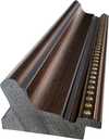
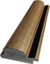


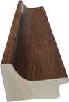
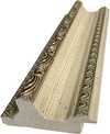
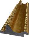
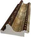
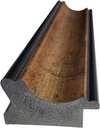
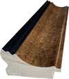

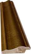

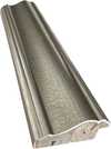
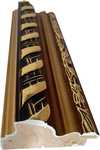


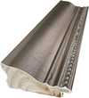
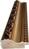


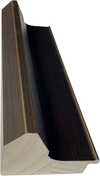
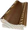

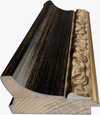
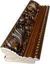

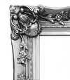
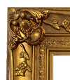
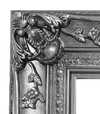
 Glasmulighed er kun tilgængelig i størrelser under 110 cm


